In my last post1*, I discussed strategies that have been beneficial for teaching visual analysis; in particular, I find it to be one of the most fulfilling topics that we address in writing classes specifically because it is so challenging within our program. I am lucky when I have at least one or two humanities & social sciences-oriented majors in my class; for the most part, the overwhelming majority of my students are STEM and typically have minimal interest in non-major-related writing courses. So, it’s challenging to attempt to bridge the gap between my investment in the material and their interest in a required class. And yes, we do the “you will be writing for the rest of your life, even if its emails to your boss” sales pitch and for a few students this monologue can be moderately successful. Otherwise, teaching visual analysis comes down to treating it like a skill that is always undergoing fine tuning, always under revision, and always making them stronger candidates to persuade others to understand and engage with their perspectives.
One of the first scenarios I offer my students is that STEM fields are rarely filled with a) strictly STEM-background individuals and b) similar personalities who analyze and interpret information and data like they do. And given that the program where I teach, we skew heavily on engineering majors, I give them real-world examples I’ve discussed with past students — anecdotes that could be applicable to them once they are finished with their degree. For my aerospace & mechanical engineering students, they need to possess the ability to analyze and comprehend visual information, a given when the field requires CAD experience and working knowledge. They also work with wind tunnel visualizations and fluid dynamics simulations; this kind of compositional skill is developed when my students engage in film analysis through the intentionality of a director’s creative direction — guiding viewership to notice, highlight, stress, and/or feature specific details. These include technical choices like focus, shot angle, perspective, tracking movement, and so on. These become visual strategies to present an innovative design to their company’s stakeholders or necessary when explaining these dynamic stress visualizations to their team in order to modify/correct problem areas.
But, if students need the objectives and significance of visual analysis, it comes down to:
- Research Communication: Communicating one’s work is certainly possible through writing; however, this work might need to be explained or illustrated for non-technical and non-related audiences that aren’t aware of the specialized language or concepts. Understanding how to convey a visual depiction of that research can make presentations more effective. This isn’t just about presenting information during a company meeting or an academic conference but producing educational materials and public engagement content.
- Pattern Recognition: Visual analysis of any kind — from two-dimensional art objects to in-the-round works to performance works to films — involves recognizing patterns, relationships, recurring elements, connections between different materials, representations, etc. Recognizing such repetition can be applicable to coding or data analysis; by recognizing ‘designs’ or ‘motifs’ which work, it makes it easier to comb through areas that require solutions or further problem-solving strategies.
- Cross-Disciplinary Engagement: Technology is not simply adapted or continued through streamlining its mechanization; technology is a tool that requires creativity and innovation, seeing things through different perspectives and understanding how these alternative viewpoints can benefit the success and progress of a ‘product’ or ‘process.’ For example, inclusive technology is the work of various disciplines; screen readers, virtual Sign Language translators, Be My Eyes app, Microsoft adaptive accessories, Tactile pavement, and even Apple’s inclusive Emoji library are all examples that combine the innovations of efficiency with creativity. We only have to look at how Apple has revolutionized tech in conjunction with its cohesive visual design principles to see how valuable the relationship is between presenting scientific and/or objective-derived information with individualized, unique design user interfacing.
- Critical Thinking & Media Manipulation: We currently live in the era of AI-generated content, so having an understanding of how visual media objects are constructed and manipulated is a valuable tool to possess. Individuals who have developed visual analysis skills can identify potential misleading information, make ethical decisions about presenting their own work, and evaluating visual communication in conjunction with marketing when new technologies and technological advancements are in play.
- Problem-Solving: Visual analysis teaches us that everyone sees very differently — and that’s great! Having the ability to recognize and understand the diversity of such perspectives makes it possible for one to consider how multiple interpretations lead to different outcomes for that information/data. Not only that, but the variety of such responses can lead to determining how different people and audiences interpret visual information and what this means for future assumptions in visual displays.
- Historical & Societal Context: We turn to the past not to simply learn from mistakes, but to reflect on how historical technologies and innovations were presented to and received by the public. Having insight to visual cues, patterns, motifs, stylistic choices, periodized aesthetics, etc. can offer insight to how these future works and processes will fit within society — locally and globally. Not only that, but it can encourage a ‘starting point’ for speculation on how these decisions will be received and how these tools/processes will be used.
- Global Communication: International and transnational communication and collaboration is another reality of our era, which is fantastic. Possessing the ability to interpret and analyze visual information can encourage understanding to how cultural differences can be bridged through visual works and acknowledge the different ways that visual information is processed and ‘accepted’ beyond one’s own immediate community, society, and culture. It also encourages transforming how products, tools, technologies, etc. are imagined and realized that will work globally.
“These are things which you tell your students?” Yes. Perhaps not in such a one-two-three order, but it’s important that they recognize that visual analysis is another skill they can add to their resume and use to their advantage when they join the professional world. Maybe their future employer won’t ask them about the symbolism of Hitchcock’s camera angles, but understanding how Hitchcock’s repertoire of aesthtics was responding to social issues that affected the general public might be beneficial for them to know — and how such visual elements can produce/evoke feelings of fear, anxiety, and paranoia.
What categories does film-based analysis use?
The four that I teach my students are:
- Semiotics
- Narrative
- Cultural/Historical
- Mise-en-scène
These were introduced by UNC-Chapel Hill’s Writing Center, which I have modified every quarter to refine specific details or examples that will be useful for them to see. I am constantly adapting them because 1) I often teach different media forms every year and 2) it is easier to give them simplified, but structured, categories because this is often their first introduction to in-depth visual examination. First year students often require (and need) direction on how and what to do. Once they’ve earned their wings, you can allow them to experiment and dabble in whatever kind of analysis they’d like.
However, I find that offering some examples can make them feel a little less nervous about doing something they haven’t practiced in an official setting. Most of my students will probably never have to take another course like this (whether film analysis, visual culture, and/or other humanities-adjacent coursework), so sometimes handholding is necessary when framing these discussions.
For this part, I keep the information brief — straightforward and to the point. They’re already overwhelmed at this point and giving them lessons on the history of each individual analytical framework is simply too much for them. While I am always entertained at the idea that I can explain the ever-expansive lineage of structuralism and post-structuralism, I tend to skip the lecture and give them cursory information so that they have enough to engage with their selected visual works.
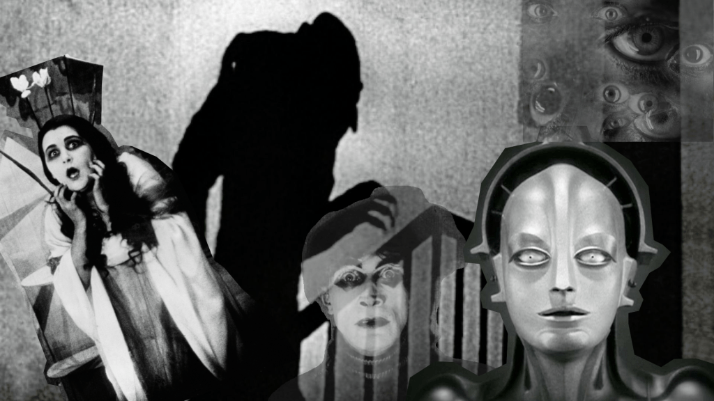
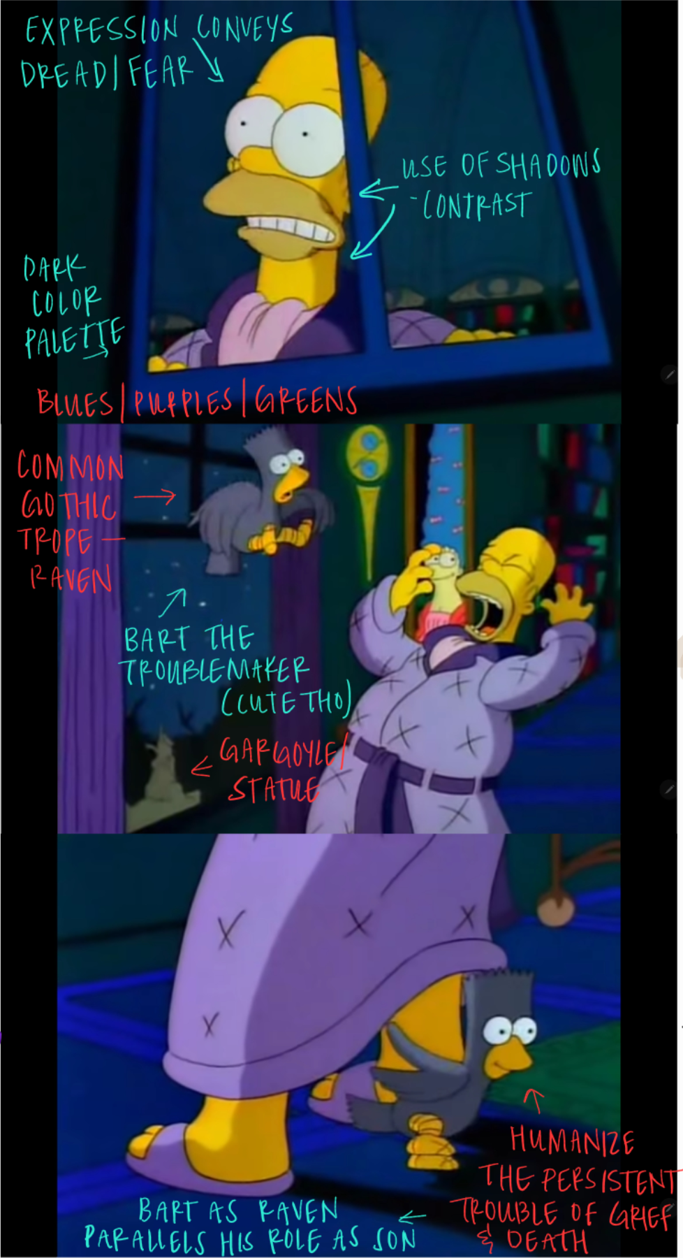
As I mentioned in the previous post, I use The Simpsons’ rendition of “The Raven” to illustrate my own approach to visual analysis. I made this unintentional observation that the perspective style in the animated short reminded me a lot of first time I watched “The Cabinet of Dr. Caligari” for my “Film as an Art Form” class, and how interesting and bizarre the jarring, asymmetrical set designs felt. It also reminded me a lot of the stylized approach Burton demanded for “The Nightmare Before Christmas.” Not only was Deane Taylor, the art director, instructed to keep Halloweentown’s color palette simple (black, white, and orange), but Halloweentown could have no right angles.2
Above all, I keep this part as simple and concise as I possibly can. These can be adapted into Google/PowerPoint slides (which I have done) so they can focus on one category of information at a time. I structure my slides with the following: image(s), for those who need a reference of what I am engaging with; guiding question, to see how to format/structure a potential research question; analysis, to demonstrate how I am proposing answering/addressing that question.
I might include other supplementary material — such as other related questions, but I often try to include these in my presentation notes so I don’t inundate them with too much. Balancing the amount of information is challenging. Too little information and students feel directionless or anxious; too much information and they feel overwhelmed with what they believe they need to know. A lot of the following information is summarized briefly in my slides, but I always offer them an extended handout of everything… some students do find it beneficial to have access to that additional material!
SEMIOTICS
Analysis focused on the interpretation of signs and symbols; determining how/what features have an underlying meaning.
Guiding question(s): “What do the excessive use of angles and/or exaggerated proportions symbolize? What do they mean?”
General observations:
- Sight lines do not follow general perspective guidelines and/or are unbalanced, appearing irregular.
- Viewpoint is uneven (inconsistent); could make the argument that it doesn’t have a definite/stable ‘vanishing point.’
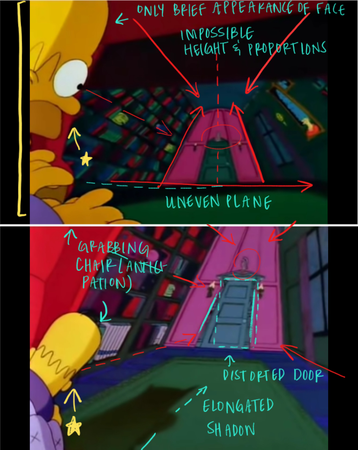
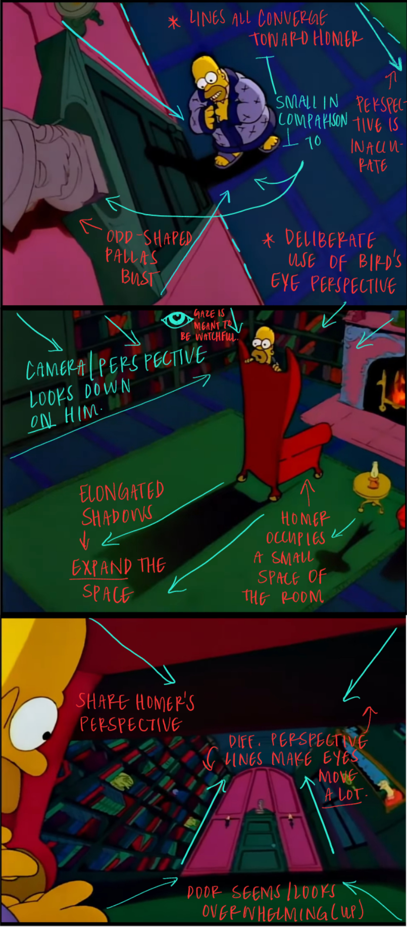
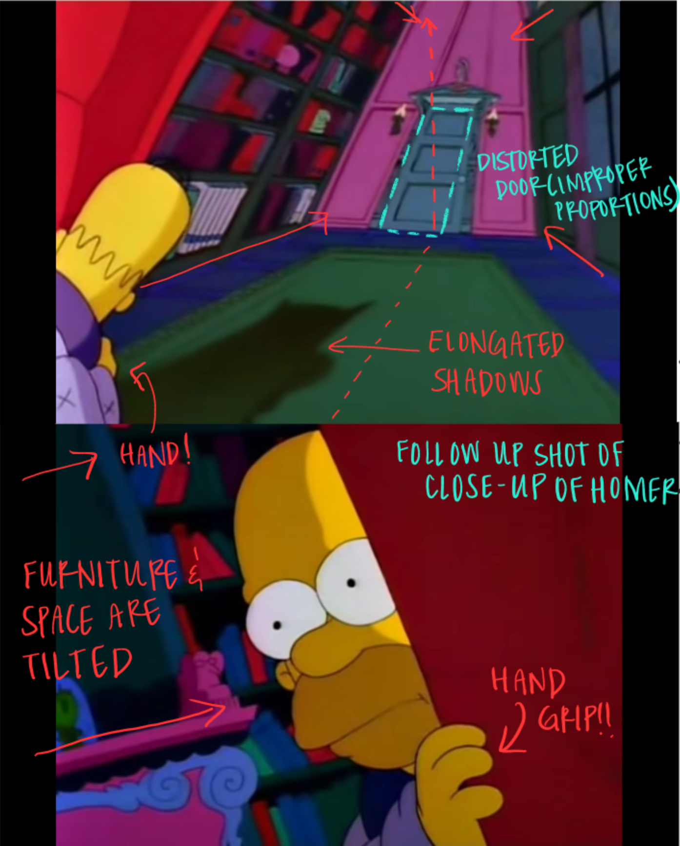
- Unstable forms — the bookcase, the study’s wall with Pallas’ bust, the distorted/slanted library books, misshapen doorway, elongated chair shadow
- Can only partially see Homer’s face or the back of his head (no discernible facial expressions); hands grasp on the edge of the chair.
Questions to ask in semiotics-based analysis:
- How do specific signs and symbols convey meaning?
- What cultural codes (tropes) does the work utilize or subvert?
- What recurring visual motifs/imagery appear throughout the work?
- Do binary oppositions help structure/create the work’s meaning? (e.g., light/dark, close vs. far away)
NARRATIVE
Analysis which examines the story’s elements, including te narrative structure, character(s), and plot. This analysis examines on what kind of story it’s trying to tell.
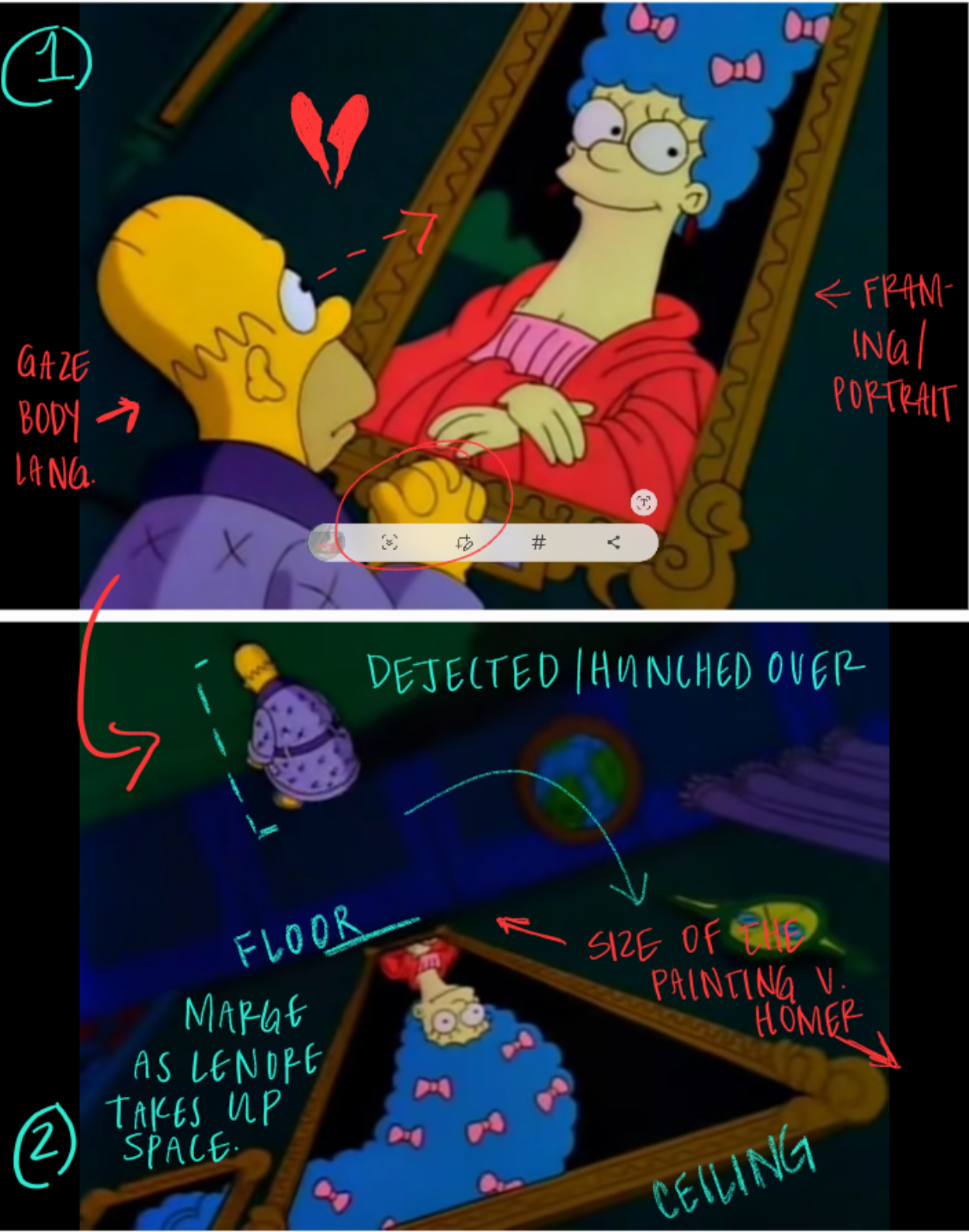
Guiding question: How is Lenore used to show (reveal to) us the narrator’s growing grief?
General observations:
- Chronologically, Homer (as the unnamed narrator) is woken from his sleep and the viewer sees a portrait of Lenore.
- During this moment, there is a use of voice over for the narrator:
- “From my books surcease of sorrow — sorrow for the lost Lenore — / For the rare and radiant maiden whom the angels name Lenore —“
- Homer’s facial expression and body language commuinicate longing — his sightline looks up Lenore’s face, hands clasped together (similar to a bodily gesture that would convey a plea/wish?)
- The look of longing is followed immediately by Homer turning from the portrait of Lenore — slumped over, facing away from view, dejected.
Questions to asked in narrative-based analysis:
- How is the story structured? (linear, non-linear, circular)
- How do character motivations drive the plot/purpose of the work?
- What narrative conventions does the film follow or subvert?
- What is the work’s narrative arc and how does it create meaning?
- What narrative gaps invite audience participation?
CULTURAL/HISTORICAL
Analysis that examines a visual object’s relationship or connection to broader cultural, historical, or theoretical contexts. This analysis works to determine how and if a visual object models, challenges, or subverts their cultural or historical making. (Is it a product of a specific point, place, and/or time?)
Guiding question: How does ‘The Simpsons’ trademark humor interact with gothic literature elements?
General observations:
- The Treehouse of Horror mimics the format of other horror anthologies — The Twilight Zone, Alfred Hitchcock Presents, Night Gallery.
- Utilizes family dynamics (Bart the son as the mischievous Raven) within gothic tropes — including use of intense shadows, the lost love, the use of the raven symbol.
- Homer demonstrates the 1960s sitcom archetype: working class but ‘father-knows-least’ trope. His confusion reflects common reading of gothic literature.
- Example: gothic lamentations like “darkness peering, long I stood there wondering, fearing,” “Quaff, oh quaff this kind nepenthe and forget this lost Lenore!” and “thing of evil!—prophet still, if bird or devil!—” are replaced by comically simple interjections, such as “Why you little…!” and “‘D’oh!”
- Historical context: Bush Sr. presidency focused on ‘education’ — make classic literature accessible via converting animation into a legitimate genre for families/family entertainment
- Homer’s confusion and descent can be perceived as genuine as a learning device rather than cartoonish/goofy/stupid.
- Playful humor as a gag overlapped with gothic literature’s focus on philosophical questoning & contemplation of death.
Questions to ask in cultural/historical analysis:
- How might different audiences interpret this work?
- How does the work represent or address specific cultural groups or identities?
- What cultural myths or narratives does the work reinforce or challenge?
- How does the work reflect or respond to specific historical events?
MISE-EN-SCÈNE
Analysis that concentrates on the arrangement and/or organization of visual elements that produce meaning. Mise-en-scène is everything that happens in front of the camera (for viewers to see), including: lighting, design, color, angles, dialogue, body positioning, framing, etc. This analysis concentrates on how these produced visual choices work with sound, editing, cinematography to communicate a message to the audience.
Guiding question: How is space used/organized to show the connection between Homer’s growing paranoia and the constriction of the living room?
General observations:
- Bust of Pallas above the door looms over Homer near the sequence’s end vs. its initial appearance as proportionately normal.
- Depth of the room is distorted — furniture gradually grows in distance from one another, room stretches like a hallway, background items (books, the lounge chair, fireplace) become sunken, transformed into smaller, less noticeable features.
- Use of bird’s eye perspective (aerial/above) causes viewer to look down on Homer, creating an isolated focal point.
- Shadows are elongated, ceiling disappears from this angle in specific shots and then becomes increasingly distant in others.
- Stretched doorways
- Rectangular room becomes parallelogram-like, distorted, misshapen
- Increased size difference between the room and Homer –> scale forces Homer to shrink amidst his growing isolation, making him appear ‘trapped.’
Questions to ask in mise-en-scène analysis:
- How does the setting function within the narrative?
- What color palette dominates and how does it evolve?
- What compositional patterns (symmetry, rule of thirds, framing) recur?
- What role does (lighting, sound, costume/props, camera movement, blocking) play in establishing mood or theme?
What’s the takeaway?
Students should know, first and foremost, that any visual analysis requires them to use observations to become evidence that supports their claim. “Here’s what I see” becomes “here’s what it means,” and students often need instruction to make that leap from descriptive to interpretive analysis; they will often say “the color blue represents life” but never explore and explain in detail how their selected work constructs that meaning. It doesn’t simply just… happen! But I always ask them to consider how and in what ways do they come to that interpretation or revelation — because that is where they need to bridge that initial reading to the deeper-level meaning.
An example of my own close reading3 of The Simpsons’ “The Raven” and German Expressionism:
What am I seeing?
(I often return to some of the basic observations I’ve made in other descriptions; repetition seems to work a miracle with my students!)
General observations:
- Elongated proportions of the study/lounge/library
- Stretched out shadow behind Homer
- No distinct, unified vanishing point
- Slightly uneven, imbalanced horizon line
- Close-up of Homer, interchangeable between semi-blank or concerned facial expression
- Wide-eyed, hand grips the chaise
- Use of a smash cut (abrupt editing technique that cuts from one shot to another), which moves from the environment/setting of the study to a quick cut close-up of Homer.
- Saturated/rich color palette — deep, vibrant reds, lush forest green, rich purples (variation)
| OVERVIEW (Description) What I am seeing… exactly as it is | In a distorted, animated scene, Homer (the unnamed narrator) peers from behind his chair in his living room, staring toward the door. The shots use a Dutch angle, deliberately tilting the viewer’s perspective. There is a use of irregular proportions — the door appears as a trapezoid and bookshelves lean toward the closed door. The room’s cool color palette of blues and greens is sharply contrasted by the bright red chaise Homer hides behind. |
These observations, when turned into descriptive statements, become…
What do I think they mean (represent)?
The Simpsons’ “The Raven” demonstrates Expressionist influence to convey the outward manifestation of paranoia, a material symptom of grief. This adaptation of Poe’s poem uses German Expressionist visual techniques not merely as a stylistic embellishment, but as a deliberate narrative strategy. By distorting the physical environment, the animation externalizes Homer’s psychological state, allowing viewers to experience his deteriorating mental condition as he processes loss. Expressionist aesthetics are a strategic medium to reveal how grief can transform one’s perception of reality, turning a familiar domestic space, a site of comfort and relaxation, into a threatening and uncertain place of inescapable loneliness and isolation.
Psychological impact of design elements
- The distorted and irregular proportions create an atmosphere of uneasiness and anxiety — producing a sense of reclutance through lopsided forms.
- The imbalanced design elements produce psychological discomfort — unstable architectural forms evoke a loss of balance/support.
- The Dutch angle combined with quick shots between the study and Homer’s close-up externalize his growing paranoia.
- Viewers simultaneously watch and experience Homer’s perspective, becoming participants in his paranoid state (the close-up of his facial expression is compounded by only seeing the back of his head in the previous, establishing shot).
Expressionist technique as meaning-maker
- Notable influences include: The Cabinet of Dr. Caligari (1922) with its tilted and distorted environments and skewed, off-balance design; Nosferatu (1922) with its emphasis on shadow play, ominous silhouettes, and creation of an atmospheric aura through purple tints and dramatic backlighting; Metropolis (1927) with its use of silhouettes and designs reflecting Art Deco, mechanical, and geometric patterning, as well as its emphasis on scale differences to construct tension and conflict; and Raskolnikow (1923) which symbolizes space through a sense of confinement and oppression via sharp angles, while using excessive distortion and shadows to convey psychological deterioration and torment.
- The animation style directly references German Expressionist cinema’s resistance to Hollywood’s “world as it is” realism.
- Key expressionist elements employed:
- Non-realistic color application (the cool blues and greens contrasted with the red chaise)
- Exaggerated, distorted, leaning structures (trapezoid door, tilting bookshelves)
- Historical/exaggerated environments as cipher for whimsical fantasy and horror
Historical and cultural significance
- German Expressionist films emerged during the deteriorating sociocultural and political conditions of Germany’s Weimar Republic
- These works functioned as commentaries on the anxiety, emotionality, and psychological consequences experienced by Germans on the cusp of the Nazi Third Reich
- This artistic movement also signaled the contemporary failure of the socialist movement.
- The stylistic choices serve as artistic interpretations of and commentaries upon discomfort and confrontation with consequences at both global and national levels.
“So what?” Why this matters
The use of expressionist techniques in this sequence doesn’t simply create an interesting visual style. Rather, they transform the animation into a psychological landscape that communicates emotional truth — and the vulnerabilities revealed through such afflictions — beyond what dialogue alone could achieve. By drawing on German Expressionist tradition, the creators connect Homer’s personal paranoia to a broader historical context of societal anxiety and impending catastrophe. Whether we perceive Homer as proxy for the German psyche or as a representation of immense loss, ‘The Raven’ provides a fictionalized yet profound visual representation of the laboriousness that undergirds dealing with the consequences and aftermath of loss and death.
This adaptation is doubly significant, functioning as a documentation of real world anxieties and devastating consequences through visual form. It’s infused with historical context — German Expressionism being inherently shaped by the sociopolitical pressures of its era — while simultaneously functioning as an opportunity to visualize how we move through processes of grief in multifaceted and diverse ways. That this complex psychological journey unfolds within an animated sequence for a mainstream television show is particularly noteworthy, a beloved American sitcom staple. The Simpsons transforms a tool of family entertainment into a vehicle for expressing profound emotional truth, making the difficult work of processing grief accessible through the medium of animation; in particular, The Raven circumvents comedy programming archetypes in its capacity to communicate and alter overwhelming experiences into serviceable understanding. In doing so, the sequence demonstrates how popular media can serve as a powerful conduit for exploring the most painful human experiences, rendering visible the typically invisible psychological labor of confronting loss.
When I initially drafted this post, I wasn’t anticipating it being so self-referential. However, I think the writing on the wall here reveals that it was simply meant to be.
Side note: I’m not quite sure what my next post will be, perhaps my latest book haul (if only to avoid overstimulation and overwhelming anyone who happens to run across these posts). I have bought quite a handful of books the last few weeks — if only because my library wall was completed with the last five shelves (yay!) — and I am itching to talk about how my ever-expanding interests are growing every day.
I picked up The Body Keeps the Score: Brain, Mind, and Body in the Healing of Trauma a few weeks ago to dig through some personal sentiments, but I’m not quite yet at a point in the publication where I am comfortable making a judgment call. I also find it might be useful to pick up Hitler’s American Model: The United States and the Making of Nazi Race Law again. I was not fond of the initial writing style, but my husband has me convinced now that I am so used to particular publication formats that I might need to try again. Perhaps its legal scholarly writing? That might be different this time, since I find Cheryl I. Harris’ writing style to be so wonderful. Stay tuned, I suppose?
Until next time.
Notes
- This was drafted weeks ago. I have only modified or corrected from the categories onward. I apologize for any inconsistencies that there may be embedded in the post’s first half. ↩︎
- The Movies That Made Us, “Nightmare Before Christmas,” Netflix, October 12, 2021, 45:00. Exact time stamp is 20:53. ↩︎
- I always tell my students that not everyone’s going to excel at synthesis right away, and first-years shouldn’t beat themselves up about it — most can’t even tell the difference between synthesis and just comparing things side by side. When I show them how I’d approach it, many have that aha! moment, though I’ve noticed a funny side effect: sometimes they try to write exactly like my example instead of developing their own approach to the process. A word of caution. ↩︎


Leave a comment